WOMEN’S RESILIENCY PROCESS
The process for this project was complex, as I ended up working my way through multiple possibilities, even going so far as to craft two mockups that go in completely different directions—each one with its own set of pros and cons.
But to start, I went to where I always begin: the sketchbook.
I began by taking a deep dive into my given non-profit: ProLiteracy—an organization aimed at helping illiterate adults across the world. The main puzzle to think through with this phase was figuring out how to narrow down the audience, as ProLiteracy was a worldwide non-profit with pretty much the broadest audience imaginable: adults to want to support reading.
After digging for a while, I determined a few sub-audiences that I could try and cater to, but one of them stuck out as being particularly interesting to me: the "#WeForShe" movement, or the "Write Her Future" movement...or the "Give Her Wings" movement? The ProLiteracy website wasn't crystal clear on the real title, but I digress. This movement under the ProLiteracy brand was aimed at bringing awareness to and helping to alleviate women's illiteracy, which would indirectly solve problems like poverty, trafficking, gender inequality, etc.
So with this in mind, I began pondering what it was I wanted this book collection to say about women's literacy. After some thinking (and word-mapping), I stumbled upon this recurring idea that literacy is the key to crafting a resilient woman—one who think critically about the world around her and come into her own as a secure and liberated human.
This was the concept I kept in mind when choosing the four books to represent the campaign. The four I chose were Little Women, Emma, Jane Eyre, and The Secret Garden. Some absolute classics, to say the least. These books all represented themes that were integral to the campaign’s message: growth, strength, wisdom, and contentment. AND they just so happened to have some prominent female roles. What a coincidence.
As I began to brainstorm a visual strategy for the book covers, I took influence from two main places: Art Deco and Minimalism. I played around with the idea of illustrating the concepts of the books/campaign using only typography, and then I did the same thing but with non-objective shapes. The results intrigued me, and I continued forward with these ideas.
TWO OPTIONS
Once it came time to put my ideas into execution, I was still mulling over two distinct styles for the cover design. I thought it over for a while, but I was still having trouble deciding on an option.
So, like any rational human, I bought a bunch of supplies and did some aggressive experimentation for two entirely different cover designs.
Though I may have stained my hands and made a bit of a mess in the process, the results were still pretty neat. I had two rough versions of possible covers before me—two paths to choose from:
Path 1 focused on pairing some solid and modern lettering with some non-objective symbolism to represent themes in the book. I began this path by experimenting with spray paint and stencils, with the idea being that this style is extremely bold and unashamed of itself.
Path 2 took a decidedly different approach—forming letters that were bold by taking up as much room as possible. I felt that this style could draw inspiration from Art Nouveau, using muted colors and extravagant patterns. With this path, I experimented with the idea of paper cutting and making the cover seem more crafted and warm.
While I experimented with physical mediums, I still played around with digital compositions. I knew at some point I would have to actually decide between the two paths, but that proved to be easier said than done. Everyone I consulted seemed evenly split on both options (including myself).
But eventually, I did decide on an option. I would draw out the suspense more, but you literally already saw the decision before you clicked on this page, so I'll just say it. I chose Option 1! *wowee*
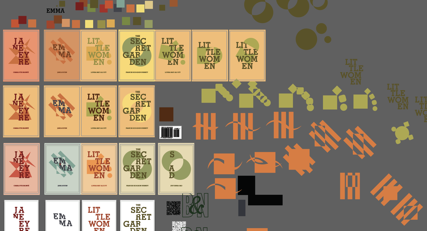
And clearly, a lot changed throughout the process. Firstly, I felt that a color palette change was greatly needed, as it went a long way to make the design feel less cold and more refined.
Additionally, even though I experimented with sprays and stencils, I gave it some more thought and felt that that look may come off more messy than intended and send the wrong message. I decided that clean vectors were best for conveying stability and boldness.
THE SPREADS : ROUND ONE
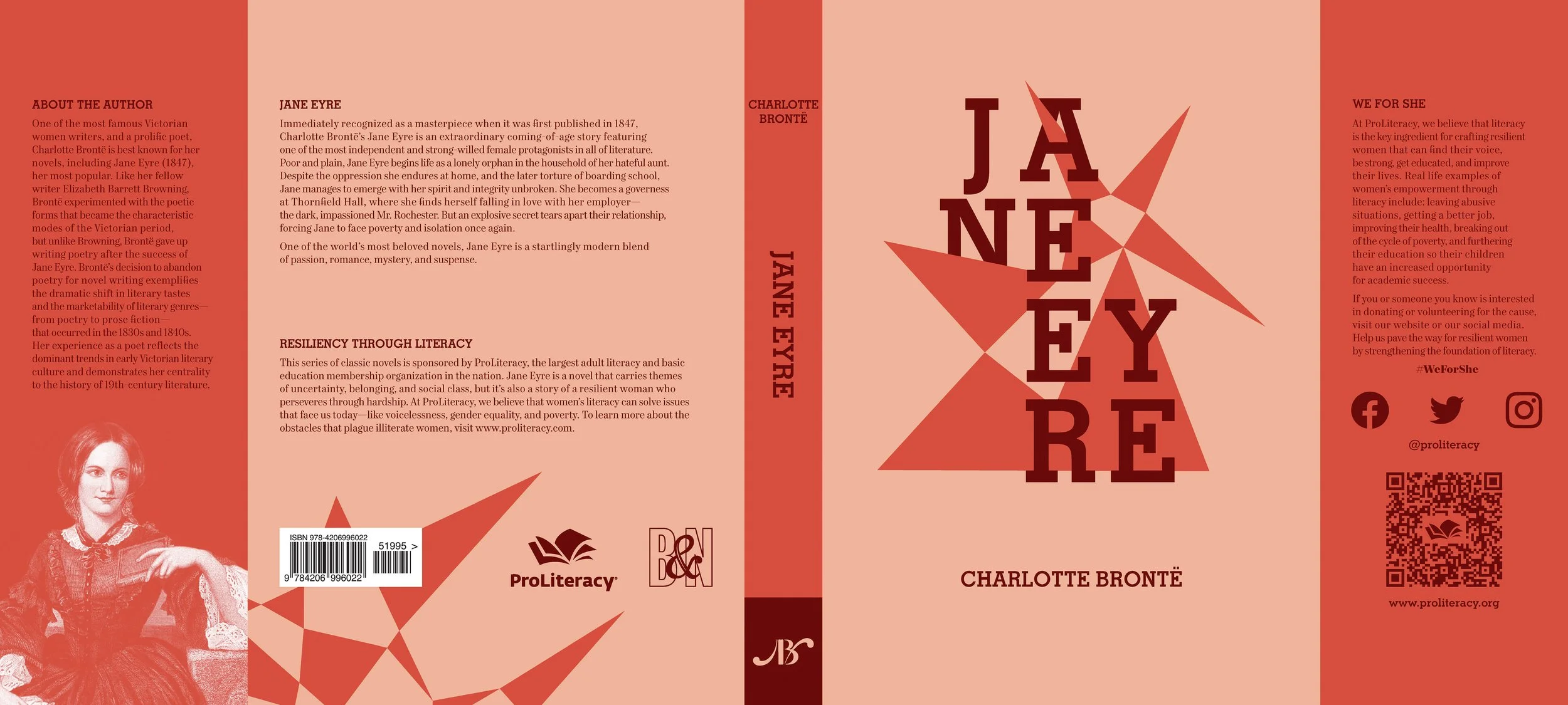
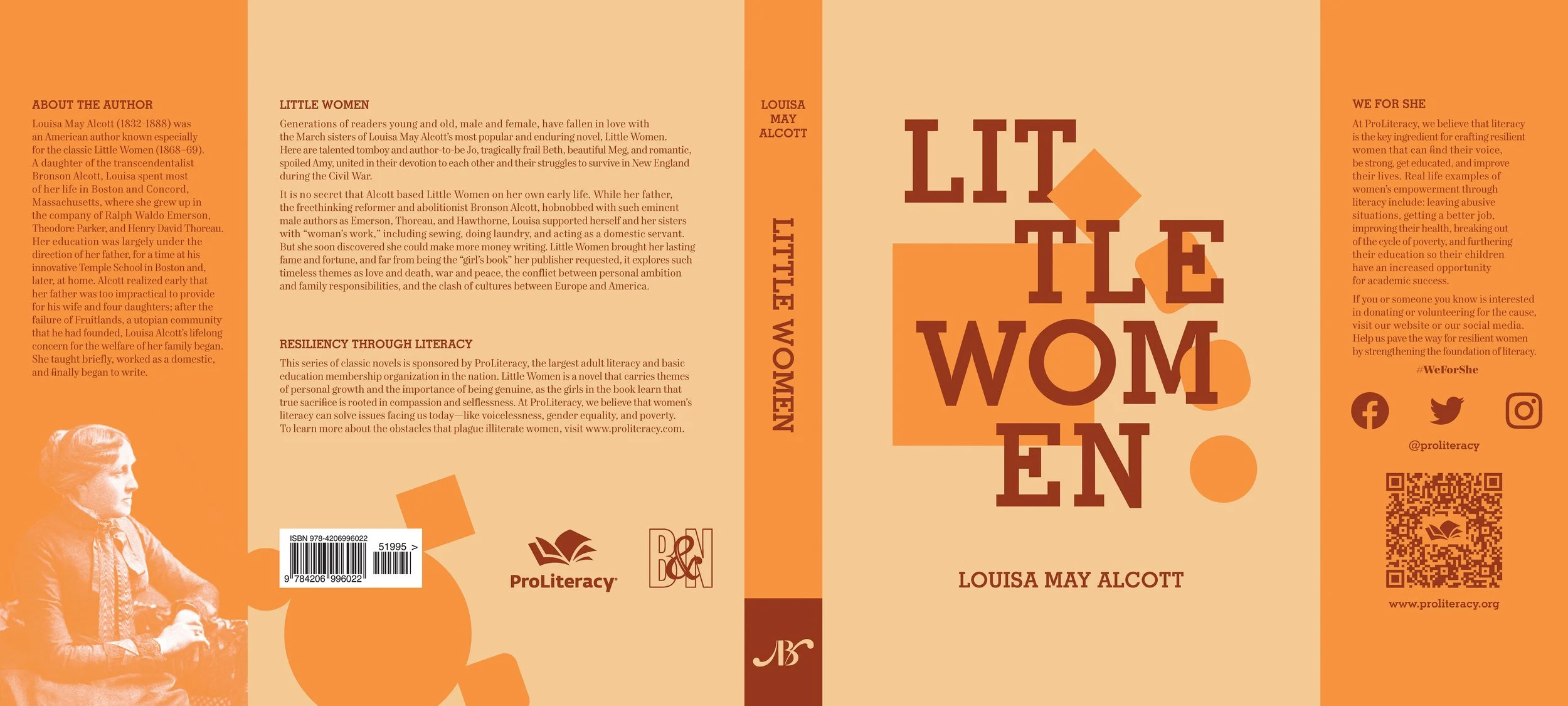
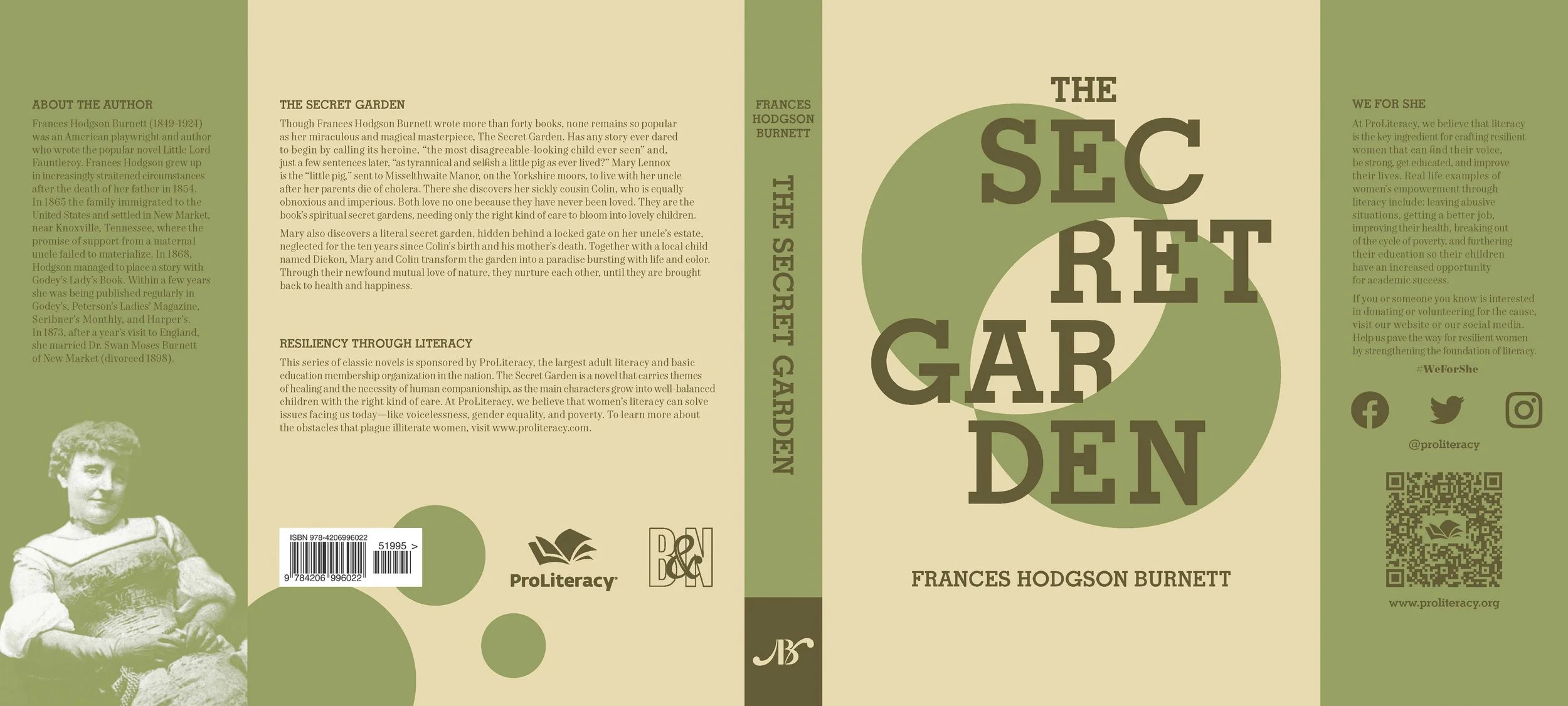
As for the actual jackets, that was just a matter of trial, error, and a heaping helping of insomnia. The first round of jackets were getting somewhere, but not quite where I wanted.
THE SPREADS : ROUND TWO
But after a thorough critique session with my colleagues, I was able to button up the issues. The main changes were compositional, with adjustments to layout, color, and typesetting all needing to be made.
As for the copy itself, all copy was either taken from the ProLiteracy website, the Barnes & Noble website, or written by yours truly.
THE FINAL BOOKS
Overall, the thing that tipped the decision in favor of this design was simply a matter of being subtle and simple with the message. Though option 2 had plenty of pros, it seemed a bit too flamboyant and like it was softening the message of strength and boldness.
THANKS FOR READING
Seriously, I appreciate it. This is definitely a condensed highlight reel of the process, but I hope you were entertained nonetheless! To read more about the final designs, head back to the main project page.


