WOMEN’S RESILIENCY
OPPORTUNITY
As a collaboration between Barnes & Noble and a given non-profit, create a series of four book jackets that communicate an idea—working as separate pieces but also as one unit.
SOLUTION
ProLiteracy is a non-profit focusing on helping illiterate adults around the world. This series of books focuses specifically on women and how literacy is the key to crafting resiliency within them.
Cover Design, Campaign Development, Research, Ideation, Copywriting
PROCESS
The process of creating the book covers took quite some time, so to read more about it, click the button below:
If you’re just interested in the results, here you go:
THE FOUR BOOKS
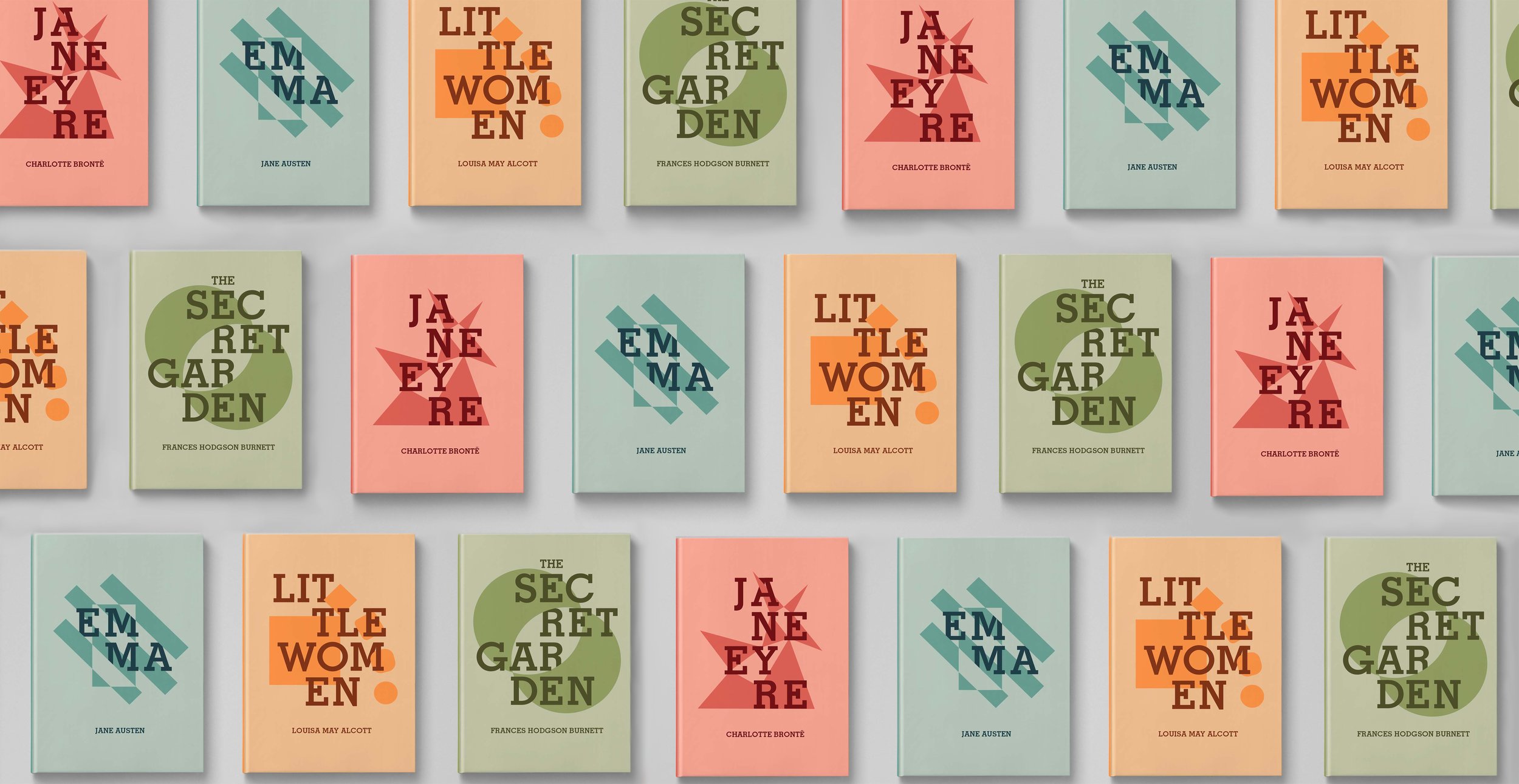
Each book is taken from the Barnes & Noble Classics collection and all represent themes that were integral to the campaign’s message: growth, strength, wisdom, and contentment.
The main aesthetic relies on solid, modern type being paired with some non-objective symbolism to represent themes in the book.
The book jackets share similar DNA, but differ in their colors and art. Each one features a summary and blurb about the concept on the back.
The front flaps feature info about ProLiteracy and calls the reader to action—utilizing the #WeForShe message as a social media tag. And of course, the back flaps feature some background info on the authors—each one a resilient woman in her own way.
JANE EYRE
Tackling concepts of uncertainty, gender relations, and social class, the classic Brontë novel tells the story of a girl fighting her way through life's trials. The abstract shape paired with the lettering represents this upward, tangled climb of anxiety that lasts through life.
EMMA
In this classic, Jane Austen includes heavy themes of social status and the confined nature of women at the time of the book's conception. The shapes of the front cover represent a sort of perplexing confinement and the obstacles to open expression. The figure-ground reversal adds to the confounding nature of these concepts.
LITTLE WOMEN
With themes of sacrifice and growth, Little Women cements itself as a classic story following the lives of girls who learn the importance of being genuine. The cover shapes are an abstract showing of sacrifice and change. The square falls from the ledge and morphs to be more well-rounded. These shapes could also be seen as a top-down view of the four sisters of the novel sitting together at a table.
THE SECRET GARDEN
A story that emphasizes the necessity of human companionship, The Secret Garden demonstrates the importance of selflessness and well-being. The front cover features an abstraction of health and companionship, as well as obscurity—shown through the R's hiding slightly behind the green forms.
CAMPAIGN
To reinforce the plausibility of this collaboration, a few campaign touchpoints were designed. These would be stationed in Barnes & Noble stores and call attention to the ideas pushed by these novels and how they relate to the importance of women's resiliency.
For more insight on the decision making and elements that went into this project, be sure to check out the process page!

